Wednesday, December 21, 2011

9/11 Memorial

This past weekend my family and I went to New York City. We visited the 9/11 Memorial and I found the design of the memorial very interesting and creative. The memorial consists of two large waterfalls leading into reflecting pools which are located where the towers once stood. On the panels around the pools are the names of every person who died in the 2001 and 1993 attacks. A variety of trees surround the pools. When I got home I looked up the design of the memorial on their website and discovered that it was chosen from an international design competition consisting of 5,201 submissions. The website shows what the finished memorial is supposed to look like and it was neat to compare with what it looks like while it is still in the process of being built. I found that the memorial is very environmentally friendly as well. The website also says that "its design conveys a spirit of hope and renewal, and creates a contemplative space separate from the usual sights and sounds of a bustling metropolis" which is a feeling I really got when at the memorial. Overall I think the design is a very successful way to commemorate such a significant tragedy and to remember all of those who gave their lives to help our country. Here are some pictures I took while at the memorial:

Monday, December 19, 2011

According to my parents and other Tech employees, many people actually noticed our projects and used the maps to go see the other ones. Great success!

Monday, December 12, 2011


Clay Piece

My clay piece ended up being very brittle. Today I tried to take it inside my dorm before I left but when I tried to pick it up, another one of the walls snapped completely off. This is the second wall that has come completely off and now I think that it looks better than I had originally made it. At first, it was lopsided and the walls were not completely connected but I like the way it looks now. I'll post a few pictures later.

Friday, December 9, 2011

site specific pieces

Walking around to all of the site specific pieces on Wednesday was a really great experience. Everyone did a wonderful job and I was really fascinated by some of the pieces. It was cool to how everyone's piece interacted with the site and what it revealed about the site. I was interested by Dani's because of its placement, it really made you wonder how she got it out in the middle of the waterfall. I liked the thought behind Mohammad's piece and how each cluster of clay pieces represented CO2 molecules. I loved Maureen's and how it fit so well with the tranquility of the space. It was also really cool to see the quality of some people's work like Conor's and Ginny. Their textures were so clean and really communicated the textures that were depicting very well and clearly. Overall it was just cool to see the wide range of products that came out from one assignment! Good job everyone

Monday, December 5, 2011

Jennifer Maestre

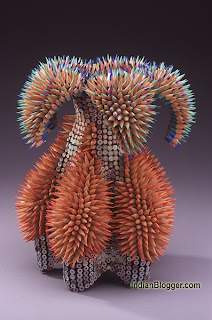
In my group's presentation today ( we were pencil and Albers) we had one slide about interesting things you can do with pencils, besides mark making. There was one image that really stood out to me when I was doing research on pencils. This artist, Jennifer Maestre, creates sculptures out of pencils inspired by sea creatures. The forms are really interesting to begin with but then the texture of the sharp pencil quills sticking out makes the piece really sand out. I am inspired by artists who transform mundane things into beautiful forms. If you're interested check out her website, she tells you how she does it:

Jennifer Maestre's website


group presentations

I thought that all of the presentations today were very interesting. Some of the comparisons were so different and dynamic between things that you think wouldn't easily be compared such as the refrigerator and the bed posts. A comparison so abstract like that really forces you to look at the formal qualities of each piece and evaluate each piece's use of space, form, and material. One principle of design that I had never thought of as a principle was parts to whole. When thinking of elements and principles, I usually think of terms such as volume, space, line, ect.; things that describe a zoomed in element of on part of a design. If evaluating an art piece, you think about that one piece. If evaluating a structure of architecture, you think about looking at that building as a whole. But what is just as valuable is looking at that architecture as a whole in comparison to its parts such as the interior and how it works with the surrounding landscape or urban planning. Furthermore, if evaluating one of Ziesel's it is important to evaluate and individual piece of the ceramics but also how say a dish compliments other parts of that particular dishware collection or the salt shaker with the pepper shaker.

Saturday, December 3, 2011

Wednesday Lecture

Although this most recent wednesday lecture was agreeably disorganized, I think many interesting points were brought up. The "suburb-effect", as he described it, probably influences your lives, although you may not realize it. I thought it was interesting how the suburbs were created, in his opinion, to get away from the hustle and bustle and dirt of the city. How they began as hybridized rural-urban living areas with connections to nature but evolved into sanctuaries of boredom, repetitiveness and uneventful lives.
At first I remarked upon the unconnected nature of the lecture's points, but now I realize that some may be applied to design, even if the comparisons are reaching.
In design, products have been simplified and had their appearance toned down in an effort to reduce user confusion and wariness towards complicated features. While the basic idea is helpful; create a user friendly layout to familiarize the public and increase sales, the reality is that a slew of indistinguishable products have overwhelmed our culture, lacking unique design and sacrificing aesthetic interest for comfort or ease of use.
I think the challenge for up-and-coming designers is to create quality, lasting products that introduce new and exciting layouts without forgetting about the all important aspects of ergonomics and simplicity.


Let's have this first one, not the second we are so familiar with.


Monday, November 14, 2011

The 6 Pillars of Steve Jobs' Design Philosophy

Here is a link to a very good article on Steve Jobs as a designer. The article is definitely worth taking a look at. Just hearing more about Steve Jobs and some of his basic design principles was very inspiring.

Sunday, November 13, 2011

Cool Art

I came across this website called Today in Art and found this article with the 20 Most Popular Posts on Today in Art for 2011. They are all really interesting and worth browsing through. A few stood out to me in particular.

The 30 Examples of Digital Artwork, Painting & Drawing on the iPad reminded me of the Wednesday lecture we had on iPad drawings. The works shown on this post are incredible.

I also liked the post on 20 Ingenious Origami and Folded Paper Creations. They made me consider another form of media that can create structure and form objects.

Two more posts stood out to me as they relate to what we're doing or already did in class. The first is the Texture Rich Digital Paintings as they deal with showing detailed textures on 2D surfaces. The other post is the 8 Drawing Exercises That Every Artist Should Practice. Some of them we did at the beginning of the year (continuous contour line drawings, gesture drawings, and value drawing) but the rest seem like great ways to keep up with sketching and practicing new techniques.

Thursday, November 10, 2011

lecture

Ok so I’ve been thinking about the lecture we had this past Wednesday and I have a few statements/questions.

First of, just so I know I have this right: Syntactic is the pieces to the whole. Semantic is the meaning and pragmatic is the purpose. Right?

Well it seems to me that, aside from projects we get in the first year of studio, people generally have an idea of the purpose of what they will be designing. Even if it is something made out of need, like the hammer example, you still know that you need something to put the nail through the wood. So wouldn’t that mess with the purely syntactical thought process?

Also, the examples of the people who focused purely on syntactic or semantic thought are void in my opinion. What they created might be “art” in some people’s eyes, but there is no purpose to these creations. Is it right to be thinking of what we are designing as art when there are people that will be utilizing and/or interacting with our designs?

I’ve always thought that something is designed well when it interacts seamlessly with its environment. That extends to people, the physical world, the human form... I think putting these three ways of thought, syntactic, semantic, and pragmatic, in a linear order is arbitrary. All three of these things should be weighed when designing, who’s to say what goes first.

Graphic Design


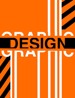
I always assumed that graphic design would be extremely easy to master. Unfortunately, when making my portfolio page I learned that I am pretty bad at it. It is important to choose a well thought-out page layout thas has meaning to it, which can be quite challenging. Below is a website that displays some really great portfolio examples!

Monday, November 7, 2011

Graphic design 2

Ok so I already posted a few basic principles to keep in mind when designing a display board. Here are a few awesome online lessons regarding all things graphic design. I will warn you, the first 10 or so are on fonts. Graphic Designers are extremely snooty about fonts. If all goes according to plan, you will be too! Haha.

elements of graphic design

There are eight design elements that are pulled together by these eight design principles.

  • Balance - Balance helps the viewer decide how to interpret your design. If it’s designed with asymmetrical balance, the design will evoke emotions like excitement, curiosity, or anxiety. If the design is symmetrical, or totally even, it will convey peace, calm, and tranquility.
  • Contrast - Without values, you can’t create contrast. Without smoothness or roughness (or the illusion of those textures), you aren’t dealing with contrast. You can use various design elements to create contrast. Without contrast there would be no day or night and without contrast you cannot create an interesting design.
  • Direction - Direction is the way to lead the viewer’s eye through your design layout or composition. Direction is created by line, but it also can be created by the way you use color to lead the eye through a design. Shapes, spaces, values, and perspective all create the illusion of depth in two-dimensional design, and this depth is needed to create a direction for the eye to take that journey. In three-dimensional design those shapes, spaces, values, and perspectives are all used to lead people through a design.
  • Economy - If you can remove an element within a design and that design still works, then you’ve practiced economy in design. Don’t offer more than is needed, but be sure to include all that is needed to create an intelligent and economical design.
  • Emphasis - You can lead that viewer all through your garden, through your building, through your advertisement, or through your painting, but if you don’t stop that viewer with one point of interest, then you’ve lost your viewer. The emphasis in a design is the message that you want to convey.
  • Proportion - You can use proportion to create surreal images (like Dali) to shock your viewers into noticing your work. Or, you can use proportion realistically to emphasize the message conveyed through typography. Proportion gives the viewer a leg to lean on. In other words, a realistic composition creates a feeling of balance, whereas unrealistic proportions create a feeling of emphasis on the object that’s out of proportion.
  • Rhythm - Repetition, rhythm, bam, bam, bam. While this principle of design can create boredom, it can also be used to create depth (one element smaller than the next), excitement or peace (contrast), or emphasis on a certain subject. Like music, rhythm keeps the world singing and dancing.
  • Unity - This is the principle that pulls a design together. While there’s no one rule for unity, this principle can remind you to check all the other design elements and principles so that you know you haven’t missed a tick in your plans.

creating texture

I wanted to create the texture on my clay slabs by pressing the leaves from my site onto the slabs but since collecting the fallen leaves a few weeks ago they have dried up. They are now too dry to peel open to reveal the texture of the inside. So, I fired my original texture cube and then am going to press that texture onto a new small slab and fire it in order to use this as my tool for creating texture. I found this video that has the idea of making the texture on a hollow log shape in order to continuously roll the texture on the slabs. This would address the issue of what to do with the sides of the slabs and how to make the sections of the texture work together.

Sunday, November 6, 2011

creating a portfolio

Since we were given the assignment of creating a portfolio page, I decided to look around a little just to get a feel for it. I found this site and thought it was pretty interesting. Under the "problems and solutions" tab, the site discusses some different aspects to consider when designing a presentation for your work.

For me personally, I'm trying to improve on things like page layout, being selective with what I include on a page, and emphasizing what's important, so this assignment was sort of challenging.

Friday, November 4, 2011

The City of Dubai

While surfing the internet, I came across an article on the city of Dubai, which is located on the northern tip of the united arab emeritus. Over the past few years, the city has become very well known for its booming economy and very ambitious architecture. The burj khalifa, which is now the tallest structure in the world, was completed in January of 2011. The skyscraper is very ambitious in its design and turned out to be very successful.

A very interesting design for a resort called "the cloud" was being considered a couple of years ago, but has yet to have been built. This resort was planned to be 300m high in the air supported by slanting legs that resemble rain.
Here is the website if you want to check it out more: http://www.designboom.com/contemporary/dubai1.html

Sunday, October 30, 2011

Tessellations


I was really interested in the assignment we had this week in class. Tesselations are really easy to make, yet they can create unique pieces of art. Robert Fathauer is a famous tesellation artist that has created astounding pieces of art. Fathauer is talented enough to create actual pictures from his tessellation designs. Anyone would definitely benefit from checking out his work. Some of his designs are featured at the website below.

Thursday, October 27, 2011

Thinking Abstractly

For anyone who has any trouble thinking on an abstract level with ideas or projects, here is a really good website that discusses the differences between abstract and concrete thinking and gives tips on how to think abstractly. It helped me a lot because it provides a solid expirations of both types of thinking and I was able to better decipher between the two. Here is the website: http://www.projectlearnet.org/tutorials/concrete_vs_abstract_thinking.html

Wednesday, October 26, 2011

Foamboard Models


I came across this website today that contains some great tips and techniques for making foam core models of buildings. The site focuses on how to create a realistic texture using limited materials, and I thought this could help with not only our current texture study and installation assignment, but with models we will have to create throughout the year. Some of the tools used while working with the texture on a piece of foam core are fine wire brushes, paintbrushes without bristles, and exacto knives (all tools most of us have in our boxes!) The artist who created this webpage pays close attention to the details in his pieces, which is something we all should keep in mind when working on our own.

Monday, October 24, 2011

ceramics with texture


I was searching for some cool ceramics stuff that related to what we're doing in studio and I found this site. Definitely check out the "installations" section, but look at some of the other stuff, too. There's some pretty intense texture going on.

Sunday, October 23, 2011

Clay


I don't know about everyone else, but I have never enjoyed working with clay. I dislike how it never stays in a definite shape and how it always changes. I did some research and found a website that discusses the terminology that people should know when working with clay. It also discusses different techniques that can be used. You should definitely check it out!

Saturday, October 22, 2011

Tips for Clay


I found this website with almost 2 thousand tips for working with ceramics. Although many of the topics do not relate to our project and the amount of tips is rather overwhelming, I found that one of the FAQs is "How do I add texture?" and it has 12 answers which may be helpful if you are having trouble thinking of ways to make certain textures or what to use to make texture. What I learned from several websites is that basically anything can be used to apply texture to clay so you should try lots of different techniques for making textures. The column on the left side of the website sorts the tips into categories in case you have a different question relating to working with clay. Hopefully these tips are helpful.Link

Friday, October 21, 2011

Materials and Processes

Course selection always seems to be a time-consuming, tedious task, even for my friends who have been here for years. It always helps to hear suggestions from those who have taken particular courses, whether it be for another major, a minor, CLEs, or electives. Prior to entering the College of Architecture and Urban Studies, I minored and Industrial Design and was able to take some ID courses before it became my major.
The one course I would recommend to any architecture and design student is Materials and Processes (IDS 2034) with Ed Dorsa. It is the best course I have taken at Virginia Tech, thus far. Ed does an amazing job explaining the stages an idea must endure to become a physical product. He also speaks in great detail about the qualities of materials used in design. This is useful when determining which material is the best option for a project or idea.
IDS 2034 is a requirement for both Industrial Design majors and minors. Even if you're not planning on formally taking ID, I think it's a good idea to take the class. It's 3 credits and definitely worth your time. It will only enhance your future projects by bettering your knowledge in these major the design field.
The book for the class is one of the few I have actually kept following the course. It's called
Materials and Design. It sits on my desk, so feel free to take a look through it.

IDS 2034 is only available in the Spring semesters.

Wednesday, October 19, 2011

Textures in Photography

Hey everyone! this is a really cool site i found about capturing textures in nature through photography. Check it out, the pictures are amazing!
http://www.designzzz.com/capturing-textures-and-patterns-in-photography/

Tuesday, October 18, 2011

Texture in Clay

http://www.ehow.com/video_2377072_fabricated-clay-texture-sheets.html
http://www.youtube.com/watch?v=Plkz3OPqUcI&noredirect=1

In trying to figure out my design for my structure, I researched some techniques on how to impose texture in the clay. I found some videos on how to do this. These techniques might help in creating the natural textures of our places. If taking an abstract path in your structure, it might be interesting to make a mold first. There are so many ways to go with clay, which I think makes this a challenge, but these videos gave me a place to start with making sketches.

Clay and Technology

Since we are dealing with photo shop and indesign and getting familiar with all that technology and we are beginning our assignment with clay I thought this was an interesting article that kind of combines the two.

http://convozine.com/2444-mason-makes/c/6902

Monday, October 17, 2011

adding contrast in photoshop

I have not worked with these programs at all before this year so I am having to look up simple things like adding contrast. The quality of my photographic study pictures was decent in color but in the black and white print out I was having trouble with how they all read at about the same gray tone. Here is one website I found with some lengthy instructions on adding contrast to a photo. There are many steps to his process which may not all be necessary but it helped me to learn about more functions and buttons in photoshop. http://www.photoshopessentials.com/photo-effects/extreme-contrast/

Adding Images in Photoshop

I haven't had much experience with photoshop, so I looked up this video tutorial on how to add an image into another image. The video is very helpful if you haven't used photoshop at all. This video is specific to adding images into other images, but there are tutorials up on youtube that step you through all aspects of photoshop.
Here is the link for the video:

Sunday, October 16, 2011

Image printing and file sizes/types

This is a graph showing the differences between what you can see, what you can see on a computer, and what you can print. Martha talked about this, but the graph helps me to see whats really going on. Before this I always thought red was red, turns out there's a big difference!

Heres some more random information about Printing, Photoshoping, etc. I have a whole powerpoint from my Photography class I anyone wants to see it.

  • JPEG- is a graphic image created  by choosing from a range of compression qualities
  • PSD- native file format of the Adobe Photoshop, enables editing
  • RAW- A image file that contains minimally processed data from the camera
  •  Resolution- determines width and height of the image in pixels and he size and density of pixels within a square inch- how large the pixels will be when you print
  • SPI- samples per inch- scanners
  • DPI- dots per inch- printers
  • PPI- pixels per inch- computers
  • Resampling/interpolating- when you try to increase your resolution- magically go from 72 PPI to 200 PPI
  •  Printers and Computers also don't look the same because they use different light (transmitted vs. reflected light)
  • Glossy Paper- gives a deeper, more brilliant, saturated color
  • Matte Paper- will not produce good strong blacks unless you have a printer that can use special black ink for matte papers
  • Copy Paper- absorbs a lot of ink and, thus, produces muted flat colors
I could keep going but you probably stoped reading already so just ask me (Shannon) if you have any questions.

Saturday, October 15, 2011

Photography Tips


Some people may think that you can not take good quality pictures without an expensive DLSR camera. However, digital cameras can take really great pictures when properly used. It is really important that you get to know your digital camera and learn all of its different settings. The below website has a video with some really great tips on how to get the best results with any camera.

Thursday, October 13, 2011

The Gates

I found some pictures from my trip to New York City in 2005 to see The Gates by Christo and Jeanne-Claude. Here is an informational excerpt from the website, "The installation in Central Park was completed with the blooming of the 7,503 fabric panels on February 12, 2005. The 7,503 gates were 16 feet (4.87 meters) tall and varied in width from 5 feet 6 inches to 18 feet (1.68 to 5.48 meters) according to the 25 different widths of walkways, on 23 miles (37 kilometers) of walkways in Central Park. Free-hanging saffron colored fabric panels, suspended from the horizontal top part of the gates, came down to approximately 7 feet (2.13 meters) above the ground. The gates were spaced at 12 feet (3.65 meter) intervals, except where low branches extended above the walkways. The gates and the fabric panels could be seen from far away through the leafless branches of the trees. The work of art remained for 16 days, then the gates were removed and the materials recycled."

Tuesday, October 11, 2011

photography

I was having a lot of trouble with focusing my camera and dealing with the blurriness of my up close pictures. I watched a few tutorials on working camera settings and found this site very helpful in learning to control my camera in different conditions: http://www.hp.com/united-states/consumer/digital_photography/tours/controls/indexb.html. This helped me greatly improve the quality of my pictures!

Photography Tips

hey guys! this is a link that talks all about lighting in photography, it should help with taking pictures of your wood models and is also cool to know for future reference!
http://www.popphoto.com/gallery/top-10-photography-lighting-facts-you-should-know?image=8#container

Monday, October 10, 2011

Photography

Our last project, taking twenty pictures of texture, was difficult for me because I have never really taken pictures that were going to be used for a presentation. I struggled with being able to know what angles, distances, and focal points were good for each picture. I came across this website that has a lot of useful information about different types of photography. Not everything will apply exactly to what we have done so far, but there is a lot of good information here.

Sunday, October 9, 2011

Photography


I know this week we are starting our unit on photography. For our texture assignment, I had a difficult time capturing quality photos. I had a hard time getting the lighting just right and my photos often had a glare. Fortunately, I found a website that offers great tips on how to improve one's picture taking skills. You should definitely check it out.

Lighting tips for a backdrop

Lighting tips


Here's a video about lighting. I tried to find a good one using small objects and this is the best I could find that was short, and just gave some quick tips on how we should be using lighting to help the full potential of the object show in a photograph. If the video doesn't work, there's a link to the left of it (lighting tips).

Thursday, October 6, 2011

Lumenhaus

Here is the direct link to the Lumenhaus to learn more from the lecture on wednesday!

http://www.lumenhaus.com/index2.html

Wednesday, October 5, 2011

Innovation Space

here's the site and some info on renting equipment, just in case anyone was interested. They have a live count of what's available (on the right of the home page). They also have tutorial videos, ways to contact them, etc...

Sunday, October 2, 2011


Do you think these are plants?
Look closely- these are made of colored pencils.
They're some of Jennifer Maestre's work!
I found them while searching for different texture,
and I just thought how she plays with the rigid material to form 3D forms and curves so intricately was really interesting.

Friday, September 30, 2011

HS-Design

HS-Design is a really impressive firm out of New Jersey. I really admire their use of design to help people. In my opinion, working for a company like HS would be really fulfilling.

Be sure to check out the portfolio link on their website.

Wednesday, September 28, 2011

Texture in Architecture

I found this website about using texture in architecture that has lot of useful information. It talks about how texture's main purpose in a building's design is to create a unique experience for occupant's senses. Texture is able to show the true quality of the materials used in the design and provide a unique feel to a building. Different themes of design utilize different textures and/or combinations of textures. All buildings have texture, but it is a question of whether the texture helps, hurts,or does nothing for the design.
Image:  Katch | Flickr
here is the link to the website:

Tuesday, September 27, 2011

Today, Lane showed by a really interesting design site called The Cool Hunter. I really recommend checking it out. There are many incredible images which include work in each of our disciplines. Scroll down the first page and there are works of architecture, industrial design, interior design, and landscape architecture.
In general, it's a good idea to navigate through these sites. They feed your curiosity and carry very inspirational pieces of work. The favorite bored-on-the-internet tool is a great way of finding news, images, and sites about the design world. "Industrial Design" and "Design" are some of my interests on StumbleUpon. Through this site, I "stumble" through so many fascinating images and articles on product design. TreeHugger is a large sustainability blog. It has an Architecture and Design section which showcases the improvements in the design world in regards to the green and sustainability movement. Another interesting ID site is Industrial Design Served which houses a collection of sites relating to new and upcoming designs and products in the industry.

Check out these images from The Cool Hunter


Texture

After making the texture rubbings this afternoon, I decided to look into textures some more and found this helpful website. It helped me to understand that everything has texture, a fact I sometimes have trouble understanding and remembering. It is easy to see that something rough or bumpy has a texture, but I never really think of something completely flat and smooth having a texture too, but it does. I also found the explanation of the difference between tactile texture and visual texture interesting and how there is texture that you can feel, like what we were using for the rubbings, and also textures on 2D surfaces, such as in photographs or drawings.
working with wood these past few weeks has been a challenge. I came into this project with the understanding that wood was a mostly stable, predictable resource. After hearing the shop guys tell me that wood can warp even over night, I had a very different impression of the material. My incredulity heightened when I learned that most of the joints had to be constructed using a makeshift procedure instead of a precise machine. Be that as it may, I learned to be very exact with my measurements to ensure that the wood joints fit perfectly. With the final iteration approaching I hope to use my findings about wood and create a successful intersection of both implied and bound planes in three dimensional space.

Monday, September 26, 2011

DC Trip

In case anyone else is interested in interior design, here's a little more about what we did and saw on our trip to DC...First we visited the Washington Nationals stadium and toured their VIP areas led by the contractors. They recently conducted about 3 or 4 million dollars worth of renovations. Then we took a tour of Fox Architects that works mainly with corporate office space and got to ask a lot of questions about how architects and designers collaborate. After, we visited Steelcase which designs innovative office furniture that is space efficient and multi-functional. There is a big stress in office design now to not have individual cubicles but move toward design that promotes collaboration. In many newly designed spaces, there is about one workspace for every six employees due to research that has shown that people can work from virtually anywhere, not just the office. Here we also had an alumni reception where we were able to speak with over 60 alumni working in the field in DC. Friday, we began with a meeting at Marriott about being LEED certified and sustainability. There is a large movement in the industry towards making conscious decisions about every aspect of the design and not designing space to last a lifetime but rather using renewable sources that can simply be updated 10-20 years down the line. Next, we visited Marriott's international headquarters where we toured their textile library, saw the designs for the next Ritz Carlton, and toured their prototype rooms for each of their brands of hotel. This was interesting to see another side to the design world apart from office space, an industry that is much more geared toward customer satisfaction and aesthetics versus functionality in an office space. Finally, we finished up our trip at Gensler, the number one interior design firm in the world. Here, they talked about how it's typically a team of directors, interior designers, architects, and engineers that work on a space. This trip was motivating to pursue design after seeing a little of how it works in the professional world.

Landscape Architecture is more than just nature.

Landscape architecture

From Wikipedia, the free encyclopedia
Jump to: navigation, search
Central Park in New York City is an example of landscape architecture.
Landscape architecture is the design of outdoor and public spaces to achieve environmental, socio-behavioral, and/or aesthetic outcomes. It involves the systematic investigation of existing social, ecological, and geological conditions and processes in the landscape, and the design of interventions that will produce the desired outcome. The scope of the profession includes: urban design; site planning; town or urban planning; environmental restoration; parks and recreation planning; visual resource management; green infrastructure planning and provision; and private estate and residence landscape master planning and design; all at varying scales of design, planning and management. A practitioner in the profession of landscape architecture is called a landscape architect.


Definition

Landscape architecture is a multi-disciplinary field, incorporating aspects of: botany, horticulture, the fine arts, architecture, industrial design, geology and the earth sciences, environmental psychology, geography, and ecology. The activities of a landscape architect can range from the creation of public parks and parkways to site planning for campuses and corporate office parks, from the design of residential estates to the design of civil infrastructure and the management of large wilderness areas or reclamation of degraded landscapes such as mines or landfills. Landscape architects work on all types of structures and external space - large or small, urban, suburban and rural, and with "hard" (built) and "soft" (planted) materials, while integrating ecological sustainability. The most valuable contribution can be made at the first stage of a project to generate ideas with technical understanding and creative flair for the design, organization, and use of spaces. The landscape architect can conceive the overall concept and prepare the master plan, from which detailed design drawings and technical specifications are prepared. They can also review proposals to authorize and supervise contracts for the construction work. Other skills include preparing design impact assessments, conducting environmental assessments and audits, and serving as an expert witness at inquiries on land use issues. They can also support and prepare applications for capital and revenue funding grants.[citation needed]
In some states, provinces, municipalities, and jurisdictions, such as Ontario, Canada and Santa Barbara, California, all designs for public space must be reviewed and approved by licensed landscape architects.

Fields of activity

The breadth of the professional tasks that landscape architects collaborate on is very broad, but some examples of project types include:[citation needed]

Specializations and related professions

Urban designers determine the physical arrangement, appearance and functionality of towns and cities, including circulation and open public space.
Landscape managers use their knowledge of landscape processes to advise on the long-term care and development of the landscape. They often work in forestry, nature conservation and agriculture.
Landscape scientists have specialist skills such as soil science, hydrology, geomorphology or botany that they relate to the practical problems of landscape work. Their projects can range from site surveys to the ecological assessment of broad areas for planning or management purposes. They may also report on the impact of development or the importance of particular species in a given area.
Landscape planners are concerned with landscape planning for the location, scenic, ecological and recreational aspects of urban, rural and coastal land use. Their work is embodied in written statements of policy and strategy, and their remit includes master planning for new developments, landscape evaluations and assessments, and preparing countryside management or policy plans. Some may also apply an additional specialism such as landscape archaeology or law to the process of landscape planning.
Green roof designers design extensive and intensive roof gardens for storm water management, evapo-transpirative cooling, sustainable architecture, aesthetics, and habitat creation.[citation needed]
Orangery at the Palace of Versailles, outside Paris

Profession

In many countries, a professional institute, comprising members of the professional community, exists in order to protect the standing of the profession and promote its interests, and sometimes also regulate the practice of landscape architecture. The standard and strength of legal regulations governing HI[what does this mean?] landscape architecture practice varies from nation to nation, with some requiring licensure in order to practice; and some having little or no regulation. In North America and Europe, landscape architecture is a regulated profession.[1]


Sunday, September 25, 2011

Blenko Glass Company


On a past comment on one of my posts, Ms. Sullivan mentioned a possible field trip to the Blenko Glass Company in West Virginia. The Blenko Glass company was founded in 1893. This company expertises in glass blowing and makes beautiful glass objects. If you are interested, I would definitely encourage you to go to this website. There is a video that shows the glass-blowing process that is quite entertaining to watch. Let's make this fieldtrip happen!

Saturday, September 24, 2011

Andy Goldsworthy

I heard about this guy a couple years ago. Andy Goldsworthy, Martha mentioned him in class, finds forms by manipulating nature. His works are often extremely temporary, some only last a few hours, but they highlight something about the material and the surroundings of the sculpture. All of his sculptures seem so simple but impossibly complex and hard to construct. Its really something you have to see:

Thursday, September 22, 2011

Iain Macarthur


I brought in his sketches when we were doing the scale drawings.
I know it's been a while since that occurred, but I realized that I forgot to post his website on here!
For all those who are interested,
http://iainmacarthur.carbonmade.com/

Wood Troubles

Working with wood is NOT easy! After my first attempt at a plane I realized I was not being very accurate and careful like i needed to be, with wood there is no way to erase your mistake or wipe it away, unlike other materials. So after reconsidering my first attempt of the plain I decided to completely start over with a new drawing and totally new shape. I was interested in angels also so i decided to construct a shape using 3 equilateral triangles using only 60 degree angels. I had to be very precise and make sure i left room for mistakes and in the end I am very proud of my new shape.

Thesis video from the southern california institute of architecture

I just found this video and absolutely had to share it with you guys. It's a sort of time-lapse video of the thesis students presentations and projects. I cant wait until we get to see our own 5th year's projects. Maybe we could walk around and look at what the 4th and 3rd years are doing this week, or have a few of them come to our studio and help us critique. Same goes for the ID, landscaping and interior seniors. I've always found it incredibly inspiring and motivating to see what they are doing.

Wednesday, September 21, 2011

Learn joints for your 3d model coming up. And an interesting 3d model video.

http://youtu.be/0AuKFeDfWHk
This first video is a video thatg I came across when I was looking on youtube for ideas on how to start my 3d drawing. The designer uses a series of cuts and folds to make the stair case literally 3d. It's a little irrelivent when it comes to our 3d model/ drawing, but it's interesting.


http://youtu.be/ToaqSx9sfQE
This video just explains a few joints. It doesn't really go into depth on how to make them, but it identifies them with actual wood pieces, so when you're doing your wood model, you could use this to give you ideas for different joints.
I suggest bridle joints. They are really strong. I know Noah in the wood shop is a huge fan of these joints. I copied a picture of an angled bridle joint because my 2d model required one of them. They are more challenging than the 90 degree angled bridle joints but they are do-able. It requires that you use the table saw so if there isn't a huge wait, I'd suggest that you ask Noah to teach you how to make these. They take a little bit more time than lap joints, but they are similar. I didn't even have to glue my bridle joint on my wood form because it was so strong, so ya, bridle joints...strong.

Ray C.

Sunday, September 18, 2011

Isometric Drawings


For some people, isometric drawings can be rather difficult to create. This week I had a hard time getting the correct perspectives to portray in my drawings. I found it very tedious having to continuously draw 30 degree angles when I was in the middle of a page and away from any straight lines to reference from. This link has some great tips for creating isometric drawings.
(picture from above website)

While surfing the internet, I came across this picture of a car museum that was designed for a competition. The structure and form of the building is very interesting. The design definitely involves the use of planes, so I thought that it ties in well with our

current work.

Automobile museum by 3GATTI Architecture Studio