Tuesday, June 26, 2012
CAUS 50th ANNIVERSARY CELEBRATION
The College of Architecture and Urban Studies (CAUS) at Virginia Tech is celebrating its 50th anniversary in 2014 and is sponsoring a competition for the design of an icon and a poster to commemorate the occasion.
Main Page for 50 Years CAUS
ICON COMPETITION
First Prize | $5,000
Honorable Mentions | $500/each
Competition Information
Thursday, May 31, 2012
Wednesday, May 23, 2012
Harvard's Graduate School of Design
I work for a lot of catering companies and today we did an event at Harvard University's Graduate School of Design. This is some of the work of the graduate students, displayed for the commencement.
This is the name of Harvard GSD's cafeteria. Though I'm pretty sure none of my coworkers understood why it is so great, I thought it was hilarious and had a laugh with one of the Harvard graduates
Saturday, May 12, 2012
Saturday, April 28, 2012
Too late for felt?
http://www.feltstudio.com/project.php?id=3&projectmenu_id=4
Wonderful uses in interior design and architecture.
Wonderful uses in interior design and architecture.
Tuesday, April 17, 2012
Check out these stair designs it'll make your head spin. There are also some other tabs dealing with some of the other disciplines.
Monday, April 16, 2012
Sustainability
I remembered that sustainability was something that we saw important to emphasize with the haybale house, or for any site in that matter. Here's a link for an organization that specializes in making spaces with buildings or no buildings more manageable and environmentally friendly. Check it out, there's some good info on there.
http://www.sustainablesites.org/
http://www.sustainablesites.org/
Sunday, April 15, 2012
The Haybale House
Ut Prosim
What a great day at the Jacksonville Center! Thank you for all of your hard work! Community service is a wonderful way for you to share your talents with others. Act with the good will you want to see in the world. You were great representatives of Virginia Tech's motto, That I May Serve. Bravo!
Wednesday, April 11, 2012
felt experimenting
http://www.trendhunter.com/slideshow/30-fabulous-felt-creations
HEre's a website that shows what's trending in the world of felt and poepleare experimenting with felt to make functional objects.
HEre's a website that shows what's trending in the world of felt and poepleare experimenting with felt to make functional objects.
Monday, April 9, 2012
Hey guys, you should all check out the website, Coroflot. It's a great place to check out companies, look for jobs, and create an online portfolio. Look at the Member Gallery to see how others have set up their Coroflot page. Go to www.coroflot.com and sign up now!

Sunday, April 8, 2012
Hey guys, I was browsing this morning and came across this image of a concept sea scraper. Aside from this awesome idea and render, I wanted to call attention to the use of silhouettes and "icons" on this poster. These simplified images communicate exactly what the designer is trying to get across while maintaining a repetitive and cohesive aesthetic. Check it out!
Thursday, April 5, 2012
Charlotte
I don't know about anyone else, but I thought it was nice getting off campus for the day yesterday. Charlotte has a nice atmosphere to it. Its a lot bigger than I was expecting and it was interesting how all of the museums were right there together in that block (interesting to see how they complimented each other). My group toured the Bechtler and during some of our free time we walked through the Mint Museum. Some of the interior design and architecture of the Bechtler was more interesting to me than the actual art itself. The fact that natural light was so emphasized in a space that contains things so sensitive to light was interesting, along with the repeated square module and how the windows framed pieces of art in neighboring showrooms. As far as the Mint Museum goes, I was very intrigued by the Fantasy exhibition (especially the trees made of pipes)!! I'm usually fascinated by mixed media art on a human scale. It was interesting to me to compare some of the works that I felt like I really appreciated versus those I didn't understand either due to their over-simplicity or their obscurity. Overall Charlotte just has a much more business oriented/bustling city personality than I expected!

Tuesday, April 3, 2012
Fashioning Felt
Felt has actually been used industrially and in handcraft work for hundreds of year but recently an exhibition put on by Cooper Hewitt called Fashioning Felt established a resurgence of the material in a variety of uses. This website shows some images from the work that was published with a wide range of furniture, clothing, and products. Felt's flexible, yet sturdy, characteristics allow it to be versatile in respect to its functions. It can be easily manipulated creating a broad spectrum of possibilities for the material.
Monday, April 2, 2012
Felt Designs
http://designdelight.blogspot.com/2007/02/illustration-felt.html
Here is a link to a blog of a women that does a lot of work with different materials in her designs as an interior designer. The page I linked is to her work with felt in light shades.
Felt in Interior Design
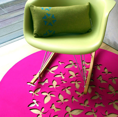 Here's some good examples of the use of felt in interior design. I think it is neat to see the variety of uses for felt, especially how it can be used as a wall covering. I think this also shows how the use of color is important, especially for the grey wall covering with cutouts that shows blue behind it. I feel like the two colors that are chosen can really change the mood and feeling of the space. There are also some of the felt panels that really interact well with light. Here a link to the website for this designer, Selina Rose, that has even more examples of her work.
2nd Post Ever
http://www.stumbleupon.com/su/2EkCyR
Check out this SA-WEEET felt construction. It's called the Hush Pod because of its function. It uses one of felt's special characteristics, which is shutting out sound. This is one of the many constructions you can do with felt. I'm currently working on this cool chair. I'll post photos of it soon.
Friday, March 30, 2012
Bechtler Museum Architect
Sorry this is so long, but apparently you can't just attach a file? This is an article about the Bechtler from before it opened (so its a couple years old). It discusses the architect and design of the building. Did you know that the entire facade is ceramic tiles? In some of the pictures you can see the tan building next to it and that's the Mint Museum. Just though you guys might like some background info before our trip on Wednesday.
This is a color picking game that gets you to first discern hue, then adds in saturation, complimentary colors, etc. It is very well crafted and made me think about color in a different light.
http://color.method.ac/
http://color.method.ac/
Tuesday, March 27, 2012
HALATION
Best example of halation I can find is the "gradient" from orange to cyan. Did anyone else find any other convincing ones?


Monday, March 26, 2012
The Principals of Movement
While looking for inspiration for our movement project, I found a "lesson" online about how to create movement by controlling the viewers eyes. By creating a path for the viewers eyes to follow, you can create moment in your work. This can be achieved through repetition, rhythm, or action. Repetition occurs when elements within a work have something in common, rhythm occurs when repetition leads to a flowing movement, and action is created through implied life and activity.


Sunday, March 25, 2012
Screen Printing blog
http://www.etsy.com/search?includes%5B0%5D=materials&q=screen+printing+art&ref=related&page=1
This is a website for screen printing. It's a blog, almost exactly like ours where people post their screen printing art and try to sell them. Take a look if u need some inspiration.
This is a website for screen printing. It's a blog, almost exactly like ours where people post their screen printing art and try to sell them. Take a look if u need some inspiration.
Movement
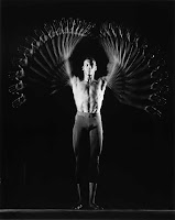
In researching movement, I discovered the work of Harold Eugene Edgerton. Edgerton, an electrical engineering professor at MIT, created and patented a series of high-speed electric flash mechanisms. This enabled his cameras to capture movement by documenting the tiniest slices of time. His work became known as "strobe photography." This technique allows for the capturing of motion (balloons during their bursting, a bullet during its impact with an apple, or tracking of a devil stick motion). Check out his website here to learn more.
Andy Warhol
Taking a huge part in making screen printing an icon for the design world, Andy Warhol became one of the most famous people in the modern arts with his prints of Marilyn Monroe, along with many others. When I visited the East Gallery in Washington D.C. last winter, I noticed his unique color combinations in his portraits, usually consisting of vibrant hues of pink and yellow, and I was also surprised by the size of some of his works that were displayed. They ranged from small, hand-sized portraits to giant full-length boards that covered an entire wall from the ceiling to the floor. The repetition of prints also made me realize the importance that the color combination has on the mood of the piece. One of his collection piece consisted of huge repeating prints that had no clear particular subject matter, relying only on their colors to convey the meaning of the prints. Based on what we've been learning this semester, there is a lot to be learned from him.
Also on this website, you can change the color combination of the Marilyn Monroe portrait to see for yourself what the colors do for the portrait!
http://www.webexhibits.org/colorart/marilyns.html
Georgia O'Keeffe
As I was doing research into different screen printing styles I came across this artist that did a lot of work in screen printing and in particular found some good examples of prints of flowers, similar to the one I did for class on Friday.
Halation
 As I was looking up information on halation, I came across this website. It was really helpful in explaining what halation is and how color is relative. The video at the bottom was especially informative. I find it so fascinating how the eye spreads color beyond its actual realm and how you begin to see a gradient that isn't really there. It is also neat to see how much colors depend on one another and how the same color on two different backgrounds can have completely different effects.
http://www.banksy.co.uk/index.html
Definitely my favorite vector artist. Use this as inspiration, or as he says on the website, "pretend you drew it yourself for art homework."
Definitely my favorite vector artist. Use this as inspiration, or as he says on the website, "pretend you drew it yourself for art homework."
Illustrator
Thursday, March 22, 2012
Movement
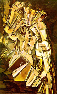 I have asked you to create a square composition expressing movement, using analogous colors and exploring halation.
Marcel Duchamp’s Nude Descending A Staircase No. 2 is one of the most influential paintings in the history of modern art, and it is one prompt you can research for capturing movement. Duchamp reinterpreted Eadweard Muybridge’s sequence of a naked woman walking down a flight of stairs from his 1887 Animal Locomotion. Duchamp combined Futurist and Cubist ideas in a unique way and depicted movement through fragmentation. Most viewers weren’t impressed by its showing in the 1913 New York Armory Show.

Tuesday, March 20, 2012
illustrator
youtube videos arent really my thing, so heres a site i used to get myself started when i was having issues figuring out illustrator. it goes over things like pen tool, blending, text, paintbrush, color, customizing your windows, etc... and they're constantly adding to it. just something i found useful!
Wednesday, March 14, 2012
Trip to Baltimore Harbor over spring break
These are just a few pictures I took while I was at the Baltimore Harbor over spring break. I was surprised just how in tune I was with the architecture surrounding the harbor and the public plaza on the harbor, and their significance. I saw buildings that were transformed from old factories to night clubs, a museum with an indoor jungle, old rusted boat parts used as statues in the plaza, the holocost memorial, and more. It was refreshing to see what I had been learning in my classes here at Virginia Tech, are excessible everywhere, and are just now being noticed for their picturesque and functional aspects of their designs, by me.
Sunday, March 11, 2012
Paper
Thursday, March 1, 2012
Inspiring art using paper
http://www.smashingmagazine.com/2010/05/29/the-beauty-of-paper-art/
This website had some inspiring designs using paper, most of which may be too complicated to create with ne 19 by 24 bristol board, but they can help to bring ideas if you're stuck. Also, their are references r related posts towards the bottom that can probably help.
This website had some inspiring designs using paper, most of which may be too complicated to create with ne 19 by 24 bristol board, but they can help to bring ideas if you're stuck. Also, their are references r related posts towards the bottom that can probably help.
Tuesday, February 28, 2012
Colors and Cultures
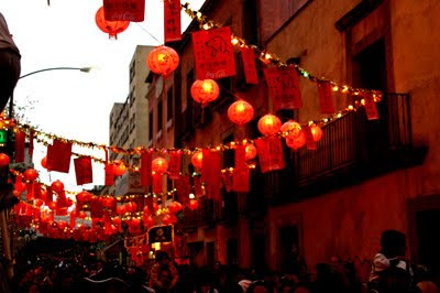
This website has a lot of information on the use of colors in a variety of cultures ranging from ancient to current. It also talks about colors relating to holidays around the world. It is very interesting to read about the varying roles of color in each place or at certain events. In class we talked about how colors are often so strongly related to a holiday so it was neat to learn more about colors relating to some holidays I was unfamiliar with as well as learning specifics about the role of colors in certain cultures.

Monday, February 27, 2012
Sunday, February 26, 2012
Color in Design
I know there are several posts on here already aboout color and design but here is another article that I found to be pretty interesting. http://www.smashingmagazine.com/2010/01/28/color-theory-for-designers-part-1-the-meaning-of-color/
Saturday, February 25, 2012
Color Mixing
we haven't gotten into mixing colors, but I found this applet that is super cool to play around with to see how colors interact with each other. Check it out!
http://www.lon-capa.org/~mmp/applist/RGBColor/c.htm
http://www.lon-capa.org/~mmp/applist/RGBColor/c.htm
Friday, February 24, 2012
Monday, February 20, 2012
Neon Colors
We discussed neon colors today in class, and there was some confusion as to where on the color wheel neon colors are and how they are made.
Apparently neon colors are created by chemicals that absorb very short wavelengths of UV light and re-emit some of the light in the visible wavelengths. These chemicals are then mixed with normal pigments and dyes to create a neon color. In normal colors, we only see the reflected light of the visual spectrum and the rest is absorbed. The normal reflected light plus the re-emitted light from the chemicals creates a reflectance of over 100%, for one or more of the eye's three color bands (Red,Green, or Blue). Therefore our eyes interpret this as unnaturally bright color.
To learn more about the science check out my source.
How We Perceive Color
This is an interesting study on the vision process.
I'd be interested to hear your thoughts about what this statement, I've having trouble depicting it myself.
I must interject here that perhaps the most fundamental conclusion that follows from this view of light interaction with the retina is that the structure of the eye represents nothing more than a materialization or objectification of the physical laws of the refraction of light using a basic geometric principle ! There is no need to introduce ”design” intelligent or otherwise.
Sunday, February 19, 2012
color schemes
Color schemes can be pretty simple when using primary and secondary hues but when you want to base a color scheme off a very dynamic gradient it can become a lot more complicated to identify its analogous or complementary hue. Here's a website that allows you to select your main hue and then it gives you several different color scheme options. This could help with projects in the next few weeks or even ideas for Naef!
Color Psychology: Literall the most important thing a designer needs to know about color.
Color and Sound
Found this interesting article relating colors with sound (for example "pure sound" vs pure colors) thought it related to Fridays class and the composition on creating rhythm and patterns with colors using shades and different hues.
CHECK IT OUT
CHECK IT OUT
The Effects of Color in Architecture
In this article I found on the effects of color in Architecture, the author discusses the power of color in architecture and design. The main points of the article involve the association, symbolism, visual effects, psychological effects, and physiological effects of color on a design. It not only discusses the power of color, but also color trends found in architecture in different parts of the world. Here is a link if you would like to check it out: http://experiencingarchitecture.com/2011/05/19/colour/
In Mechanical dimensioning, the dimensions should be staggered so as not to be redundant. This is not as necessary in architectural dimensioning. Dimensions should be spaced 3/8 of an inch away from the object and then 1/2 inch for every dimension out after the first in architectural dimensioning. Mechanical dimensions are equally spaced. the line weights should be about .35 mm, about the same as a 2H pencil. The object itself should have a line weight of about .7 mm, roughly an HB pencil lead width. text should be centered within the dimension unless it overlaps other text. in Mechanical dimensioning, all the text is written in the same orientation. The dimensions are in decimals as well. In architectural dimensioning, text is written according to what view is being dimensioned. Text should be written in feet and inches. A space of 1/8 of an inch should be put between the extension lines and the object, and the extension lines should extend past the dimension lines that same distance. The arrows should be 3/16 x 1/16 and be placed inside unless the text does not allow for them to fit. Architectural dimensioning uses tick marks instead of arrows. Never use dots. They look dumb. Dimensions are shown as such while radius's are indicated with a arrow passing through their center mark toward the dimension. That's about all you need to remember.
http://colormatters.com/
This site has pretty much everything you could want to know about color, including two important sections relating to design and marketing and the roles color plays in each.
This site has pretty much everything you could want to know about color, including two important sections relating to design and marketing and the roles color plays in each.
Color Theory
Kinda just the first thing that popped into my mind when we started discussing Color Theory, here's a skate video with that same title. The filters used create high contrast and interesting color blends, often illuminating just one color among a black and white background.
http://www.youtube.com/watch?v=yENwRwN8S9c&hd=1
http://www.youtube.com/watch?v=yENwRwN8S9c&hd=1
color basics
this site is pretty good at covering the basics pertaining to color theory and what not... if you check out the side bar, you can get more info on the color wheel, color systems and combinations, contrast, etc... it also has a lot of good vocab that could be useful.
Color and Lighting in Design
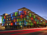 What is color? By definition, color is a property possessed by an object of producing different sensations on the eye as a result of the way it reflects or emits light. However, many fail to recognize the difference between light and color in various fields of design. While lighting aims to achieve levels of visibility and comfort in architecture, color attempts to solve the needs of design, style and fashion, while also creating a mood. While most people do not see the importance of lighting and color on the surface, both elements are extremely significant for human comfort. It has been proven that color and lighting help improve fundamental aspects of life such as health, security and and emotion. This article describes further in depth the importance of light and color in architecture, and can be applied to all other fields of design as well.
Read article here.
Saturday, February 18, 2012
Color Design
I was looking up designs dealing with interaction between complementary colors and came across this website. It explains many different styles different colors can be used together and the effects that they create when combined. Thought it was interesting and thought that it might help as we go more into the topic of color in studio.
Types of Wood
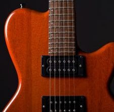
I know some people want to take into account the sound their toy makes for the naef competition. I was doing some research about different types of wood and I found a really interesting site for the different woods used in musical instruments and the different sound qualities they help produce. I would recommend checking it out.
Thursday, February 16, 2012
Homage to the Square
Here is the video that shows some similar examples to what we looked at in class. It is a student of Albers explaining Homage to the Square.
Albers Homage To The Square: An Explanation from Richard (Dick) Nelson on Vimeo.
Thursday, February 9, 2012
Juhani Pallasmaa Lecture
Last night, I went to the Juhani Pallasmaa's lecture that was held in the Hancock Hall 100. The object of his lecture was atmosphere: atmosphere in architecture and arts, in terms of the emotion that a space or place portrays. The atmosphere of the architecture controls one's experience in the space, which is the fusion/interaction between the object and the subject. It can lead to the recognition of place and space, as well as cause the unconscious perception of the purpose of the architecture.
One of the things that I was surprised about was the idea of the quality of the whole controlling the details. I've usually thought the other way: as the quality of the details controlling the quality of the whole. But Juhani Pallasmaa's lecture indicated that the overall atmosphere of space controls the perception and experience of the viewer, therefore the details are somewhat secondary. Without understanding the whole, we cannot enjoy the details.
Even though I had a hard time grasping the concept of some parts of the lecture, it was enjoyable, and was a great learning experience. I recommend that you guys attend the future lectures done by guest speakers. There are some very successful and inspiring guests that are coming this semester! Time and place for the guest speakers are in the posters that are hung all over Cowgill, including the 2nd floor lobby and next to the elevators on the 4th floor.
Wednesday, February 8, 2012
Naef Rainbow and Cella Toys
Hey Everyone! I wasn't sure if any of you had YouTubed Naef Toys, but there are a lot of really cool demonstration videos. I found one on the Rainbow toy (one of the toys we played with today) and its turns out to be much more than we saw. This video shows the versatility of just one Naef toy. It combines shape, sound, color, and functionality into one. definitely Check it out!
The Second link is one to the Naef toy called Cella, it can be manipulated, stacked, and nested into a ton of awesome shapes and figures. Its cool to see how something so simple can actually transform into a complex and interesting form.
Tuesday, February 7, 2012
playful art and architecture
After researching about Naef toys, their mission, and previous designs, I came across this blog that provides some examples of playful architecture in society. This type of architecture, practical or not, basically keeps the same sort of ideals in mind. It promotes imagination, creativity and an inspiring environment. Then I stumbled across this website for PLAY ART which has a lot of similar intentions as Naef. They want to provide society with revolutionary toys that interact the user in a much more design focused way.
3D power!
Monday, February 6, 2012
Naef
Be sure to check out the history section (link below) on Naef's website. You can learn a lot about a company and its motives by researching its past. Knowing the trial and tribulations of a company's history can give you hints into the quality of product they are producing and how passionate they are about running their company.
Timelessness of Naef toys (research)
After about an hours worth of researching naef toy designs, I stumbled upon some toy designs that they made videos of. I noticed a common trend in these toys. Most if not all are colored with "playful colors" in reference to the design of toy. Also, parts to a whole seem to be very important in all there designs. I noticed most are like puzzles that can be transformed and rearranged to make "new toys" in a sense. The design itself is simple but their functions give you a deeper understanding of the toys. I chose the diamant and the rainbow designs because they are so simple, but can be transformed into many different things. I these because it leaves the function of the toy up to the imagination of the person playing with it. There's a sense of timelessness aswell with these 2 designs that I found very intreging. In the rainbow it features a little boy playing with this toy, yet for both I can imagine children of young ages playing with it, and I could also see them sitting on an office desk of a corporate employee, who uses them as show and almost as a stress reliever, as they experience the toy ans different forms. The sense of timelessness and parts to a whole will play a huge factor in the decisions of the judges I think.
Sunday, February 5, 2012
Window shade designs
http://www.archdaily.com/175686/cobogo-house-marcio-kogan/34_-erwin-com-carol-interna-vertical/
Look at those shades! With the help of light, repeating circular designs are created throughout the house by the cutout of those window shades.
Steel
Since we're working with metal, this article talks about the evolution of steel in architecture. I thought it is pretty neat on how buildings became greater and taller as history goes on with steel. It also gives a list of some famous architecture buildings dealing with lots of steel!
Light and Shadows
This link shows some works of random household objects displacing light and creating shadows. It gave me some inspiration for my design with my metal piece.
Thursday, February 2, 2012
naef toys
Out of the Naef's newest collection of toys the Rainbow is my favorite. I think it is very successful because of how interactive it has the potential to be aside from creating other forms or designs. The fact that it can be aligned into a track or has a musical quality to its material are features that draw in a younger generation. Even those these toys are intended for all ages, the dominant age group is going to inevitably be children. The Fluctus also has a lot of these playful characteristics aside from being simply being toys of versatile design. I am looking forward to creating something functional but these toys definitely set a very high standard for the versatility and intrigued of our designs!
Wednesday, February 1, 2012
the Discipline of Design
I hope this video of Kurt Naef Toy Makers inspires you to reflect on some of what the SA+D considers valuable to the discipline of design.
Inquiry
Exploration
Experimentation
Iteration
Evaluation
Discovery
Tuesday, January 31, 2012
Anyone else obsessed with the chapel roof designed by the architect who came to speak to us on monday?
His inspiration, craftsmanship, and dedication to documenting the process really gave me an idea of the level of work expected from older students. I hope I put as much work and thought into my final project as he did.
His inspiration, craftsmanship, and dedication to documenting the process really gave me an idea of the level of work expected from older students. I hope I put as much work and thought into my final project as he did.
Examples of familiar diagrams
Monday, January 30, 2012
As I briefly discussed in studio, during break, many people would ask me about industrial design. Though I would thoroughly explain my major to my friends and their families, it was interesting to see that one of my friends was unknowingly dabbling in ID himself. He started a company called Eden Racing a little over a year ago. As a professional skater, it became his goal to manufacture products for other skaters at reasonable prices. His hand-made boards are a perfect example of the industrial design process. Recently, he enhanced his CNC machine process for one of the Eden boards which can be viewed in the YouTube video below.
Subscribe to:
Posts (Atom)


