Monday, December 12, 2011
Clay Piece
My clay piece ended up being very brittle. Today I tried to take it inside my dorm before I left but when I tried to pick it up, another one of the walls snapped completely off. This is the second wall that has come completely off and now I think that it looks better than I had originally made it. At first, it was lopsided and the walls were not completely connected but I like the way it looks now. I'll post a few pictures later.

Friday, December 9, 2011
site specific pieces
Walking around to all of the site specific pieces on Wednesday was a really great experience. Everyone did a wonderful job and I was really fascinated by some of the pieces. It was cool to how everyone's piece interacted with the site and what it revealed about the site. I was interested by Dani's because of its placement, it really made you wonder how she got it out in the middle of the waterfall. I liked the thought behind Mohammad's piece and how each cluster of clay pieces represented CO2 molecules. I loved Maureen's and how it fit so well with the tranquility of the space. It was also really cool to see the quality of some people's work like Conor's and Ginny. Their textures were so clean and really communicated the textures that were depicting very well and clearly. Overall it was just cool to see the wide range of products that came out from one assignment! Good job everyone
Monday, December 5, 2011
Jennifer Maestre

Jennifer Maestre's website

group presentations
I thought that all of the presentations today were very interesting. Some of the comparisons were so different and dynamic between things that you think wouldn't easily be compared such as the refrigerator and the bed posts. A comparison so abstract like that really forces you to look at the formal qualities of each piece and evaluate each piece's use of space, form, and material. One principle of design that I had never thought of as a principle was parts to whole. When thinking of elements and principles, I usually think of terms such as volume, space, line, ect.; things that describe a zoomed in element of on part of a design. If evaluating an art piece, you think about that one piece. If evaluating a structure of architecture, you think about looking at that building as a whole. But what is just as valuable is looking at that architecture as a whole in comparison to its parts such as the interior and how it works with the surrounding landscape or urban planning. Furthermore, if evaluating one of Ziesel's it is important to evaluate and individual piece of the ceramics but also how say a dish compliments other parts of that particular dishware collection or the salt shaker with the pepper shaker.
Saturday, December 3, 2011
Wednesday Lecture
Although this most recent wednesday lecture was agreeably disorganized, I think many interesting points were brought up. The "suburb-effect", as he described it, probably influences your lives, although you may not realize it. I thought it was interesting how the suburbs were created, in his opinion, to get away from the hustle and bustle and dirt of the city. How they began as hybridized rural-urban living areas with connections to nature but evolved into sanctuaries of boredom, repetitiveness and uneventful lives.
At first I remarked upon the unconnected nature of the lecture's points, but now I realize that some may be applied to design, even if the comparisons are reaching.
In design, products have been simplified and had their appearance toned down in an effort to reduce user confusion and wariness towards complicated features. While the basic idea is helpful; create a user friendly layout to familiarize the public and increase sales, the reality is that a slew of indistinguishable products have overwhelmed our culture, lacking unique design and sacrificing aesthetic interest for comfort or ease of use.
I think the challenge for up-and-coming designers is to create quality, lasting products that introduce new and exciting layouts without forgetting about the all important aspects of ergonomics and simplicity.
Let's have this first one, not the second we are so familiar with.


Monday, November 14, 2011
The 6 Pillars of Steve Jobs' Design Philosophy
Here is a link to a very good article on Steve Jobs as a designer. The article is definitely worth taking a look at. Just hearing more about Steve Jobs and some of his basic design principles was very inspiring.
Sunday, November 13, 2011
Cool Art
I came across this website called Today in Art and found this article with the 20 Most Popular Posts on Today in Art for 2011. They are all really interesting and worth browsing through. A few stood out to me in particular.
 The 30 Examples of Digital Artwork, Painting & Drawing on the iPad reminded me of the Wednesday lecture we had on iPad drawings. The works shown on this post are incredible.
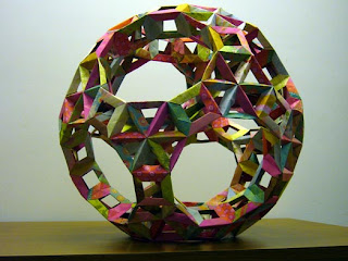
I also liked the post on 20 Ingenious Origami and Folded Paper Creations. They made me consider another form of media that can create structure and form objects.
Two more posts stood out to me as they relate to what we're doing or already did in class. The first is the Texture Rich Digital Paintings as they deal with showing detailed textures on 2D surfaces. The other post is the 8 Drawing Exercises That Every Artist Should Practice. Some of them we did at the beginning of the year (continuous contour line drawings, gesture drawings, and value drawing) but the rest seem like great ways to keep up with sketching and practicing new techniques.
 The 30 Examples of Digital Artwork, Painting & Drawing on the iPad reminded me of the Wednesday lecture we had on iPad drawings. The works shown on this post are incredible.
I also liked the post on 20 Ingenious Origami and Folded Paper Creations. They made me consider another form of media that can create structure and form objects.

Two more posts stood out to me as they relate to what we're doing or already did in class. The first is the Texture Rich Digital Paintings as they deal with showing detailed textures on 2D surfaces. The other post is the 8 Drawing Exercises That Every Artist Should Practice. Some of them we did at the beginning of the year (continuous contour line drawings, gesture drawings, and value drawing) but the rest seem like great ways to keep up with sketching and practicing new techniques.
Subscribe to:
Posts (Atom)