Monday, November 14, 2011
The 6 Pillars of Steve Jobs' Design Philosophy
Sunday, November 13, 2011
Cool Art
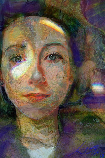
 The 30 Examples of Digital Artwork, Painting & Drawing on the iPad reminded me of the Wednesday lecture we had on iPad drawings. The works shown on this post are incredible.
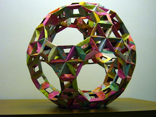
I also liked the post on 20 Ingenious Origami and Folded Paper Creations. They made me consider another form of media that can create structure and form objects.

Two more posts stood out to me as they relate to what we're doing or already did in class. The first is the Texture Rich Digital Paintings as they deal with showing detailed textures on 2D surfaces. The other post is the 8 Drawing Exercises That Every Artist Should Practice. Some of them we did at the beginning of the year (continuous contour line drawings, gesture drawings, and value drawing) but the rest seem like great ways to keep up with sketching and practicing new techniques.
Thursday, November 10, 2011
lecture
Ok so I’ve been thinking about the lecture we had this past Wednesday and I have a few statements/questions.
First of, just so I know I have this right: Syntactic is the pieces to the whole. Semantic is the meaning and pragmatic is the purpose. Right?
Well it seems to me that, aside from projects we get in the first year of studio, people generally have an idea of the purpose of what they will be designing. Even if it is something made out of need, like the hammer example, you still know that you need something to put the nail through the wood. So wouldn’t that mess with the purely syntactical thought process?
Also, the examples of the people who focused purely on syntactic or semantic thought are void in my opinion. What they created might be “art” in some people’s eyes, but there is no purpose to these creations. Is it right to be thinking of what we are designing as art when there are people that will be utilizing and/or interacting with our designs?
I’ve always thought that something is designed well when it interacts seamlessly with its environment. That extends to people, the physical world, the human form... I think putting these three ways of thought, syntactic, semantic, and pragmatic, in a linear order is arbitrary. All three of these things should be weighed when designing, who’s to say what goes first.
Graphic Design

Monday, November 7, 2011
Graphic design 2
Ok so I already posted a few basic principles to keep in mind when designing a display board. Here are a few awesome online lessons regarding all things graphic design. I will warn you, the first 10 or so are on fonts. Graphic Designers are extremely snooty about fonts. If all goes according to plan, you will be too! Haha.
elements of graphic design
There are eight design elements that are pulled together by these eight design principles.
- Balance - Balance helps the viewer decide how to interpret your design. If it’s designed with asymmetrical balance, the design will evoke emotions like excitement, curiosity, or anxiety. If the design is symmetrical, or totally even, it will convey peace, calm, and tranquility.
- Contrast - Without values, you can’t create contrast. Without smoothness or roughness (or the illusion of those textures), you aren’t dealing with contrast. You can use various design elements to create contrast. Without contrast there would be no day or night and without contrast you cannot create an interesting design.
- Direction - Direction is the way to lead the viewer’s eye through your design layout or composition. Direction is created by line, but it also can be created by the way you use color to lead the eye through a design. Shapes, spaces, values, and perspective all create the illusion of depth in two-dimensional design, and this depth is needed to create a direction for the eye to take that journey. In three-dimensional design those shapes, spaces, values, and perspectives are all used to lead people through a design.
- Economy - If you can remove an element within a design and that design still works, then you’ve practiced economy in design. Don’t offer more than is needed, but be sure to include all that is needed to create an intelligent and economical design.
- Emphasis - You can lead that viewer all through your garden, through your building, through your advertisement, or through your painting, but if you don’t stop that viewer with one point of interest, then you’ve lost your viewer. The emphasis in a design is the message that you want to convey.
- Proportion - You can use proportion to create surreal images (like Dali) to shock your viewers into noticing your work. Or, you can use proportion realistically to emphasize the message conveyed through typography. Proportion gives the viewer a leg to lean on. In other words, a realistic composition creates a feeling of balance, whereas unrealistic proportions create a feeling of emphasis on the object that’s out of proportion.
- Rhythm - Repetition, rhythm, bam, bam, bam. While this principle of design can create boredom, it can also be used to create depth (one element smaller than the next), excitement or peace (contrast), or emphasis on a certain subject. Like music, rhythm keeps the world singing and dancing.
- Unity - This is the principle that pulls a design together. While there’s no one rule for unity, this principle can remind you to check all the other design elements and principles so that you know you haven’t missed a tick in your plans.